Case Study: Isabel Marant Website
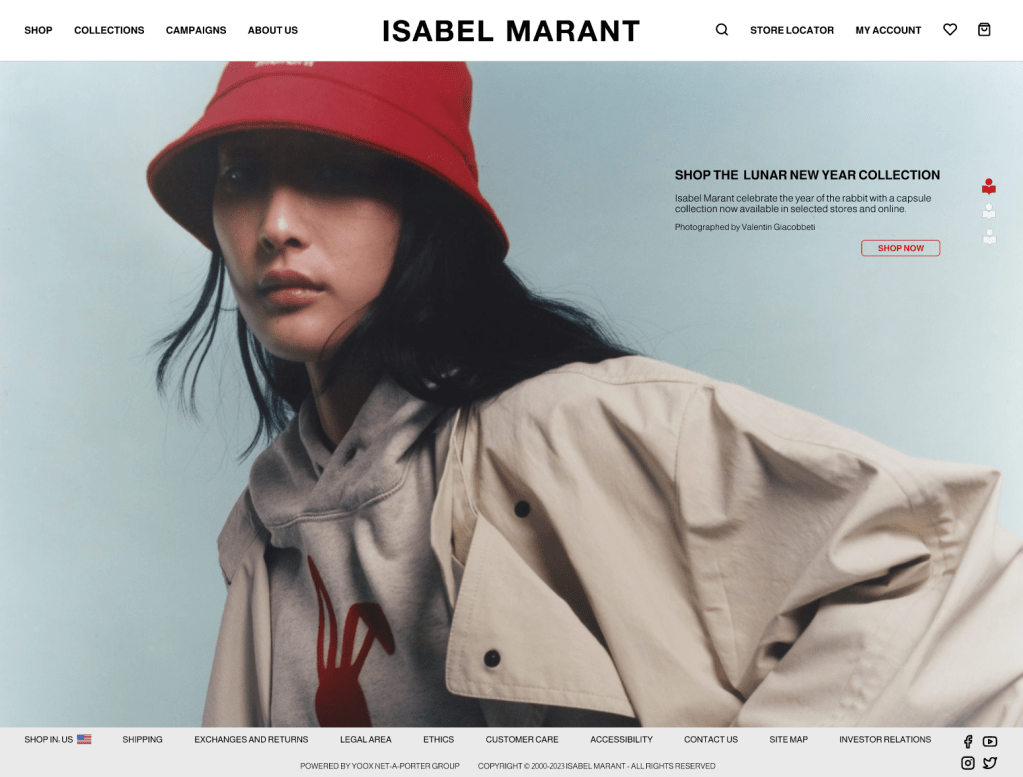
Preview Isabel Marant desktop website: Isabel Marant
Program used: Figma


The Problem
Isabel Marant is a luxury clothing brand with a minimalistic and straight-forward website. It features a hero image or video, a side navigation bar, and ample negative space.
I appreciate the simplicity, visually; however, it may also give off the impression of a budget website or a website built only on HTML.
Isabel Marant’s navigation is also simple and navigation is minimal, but I think it could use a bit more organization by adding a second navigation bar.
The Goal
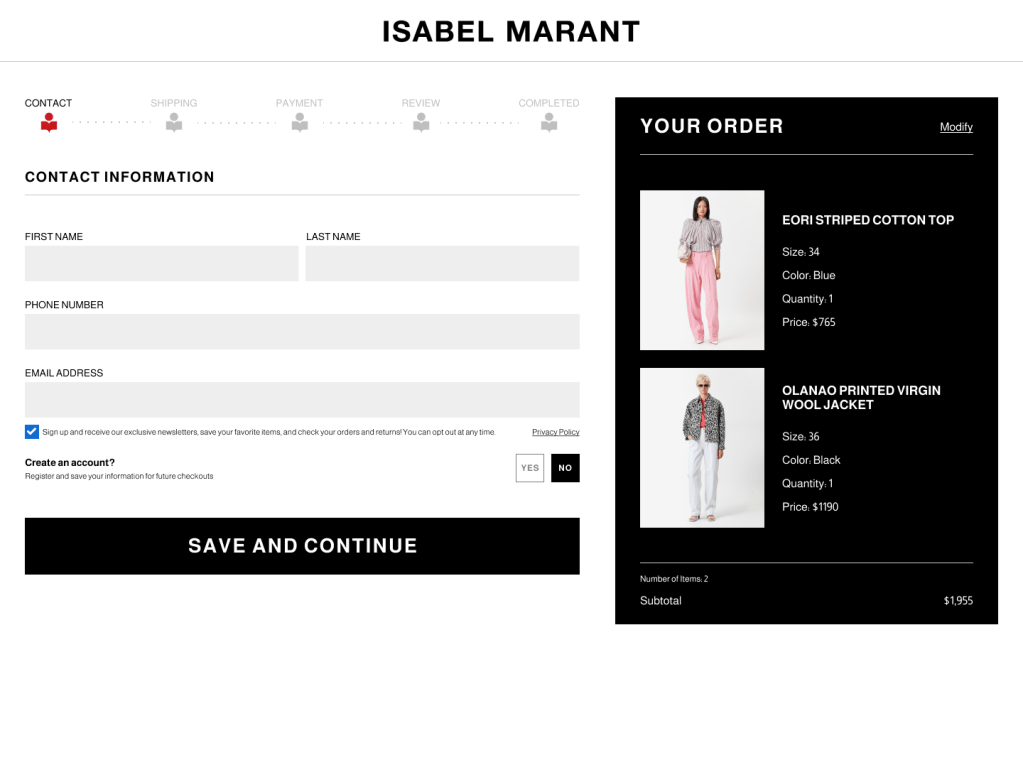
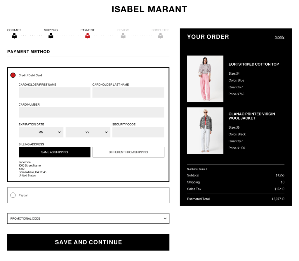
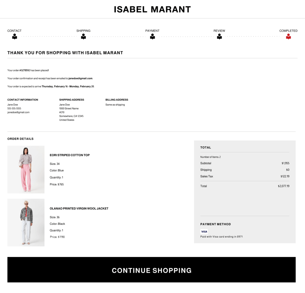
For my case-study, I want to respect Isabel Marant’s minimalism, maintain and improve their simple navigation, and improve aesthetics to increase the appearance of legitimacy and better-align with their high-end branding.
 Improve aesthetics to align with high-end branding
Improve site navigation and add more feedback animations
Conclusion
Isabel Marant’s original website is minimalistic and simple to navigate; however, I found it too minimalistic and lacking in strong branding.
I retained a minimalistic aesthetic while applying stronger design choices to reinforce a high-end, contemporary, brand image. I did this with a lot of negative space, brand colors and images, consistent typography, and adding intuitive feedback elements (such as the checkout progress bar).
Overall, I’m very happy with the results of my case-study. I think the prototype looks great, feels intuitive, and gives Isabel Marant the high-end website they should have.
In the future, I’d like to add a “Lunar New Year” page for users to navigate to from the home page.
SCREENS AND PROTOTYPING
Click on the links below to read my write-up for the respective screens and prototyping.
