Isabel Marant: The Shopping Experience
Slide left/right to compare original Isabel Marant shopping page to my concept shopping page
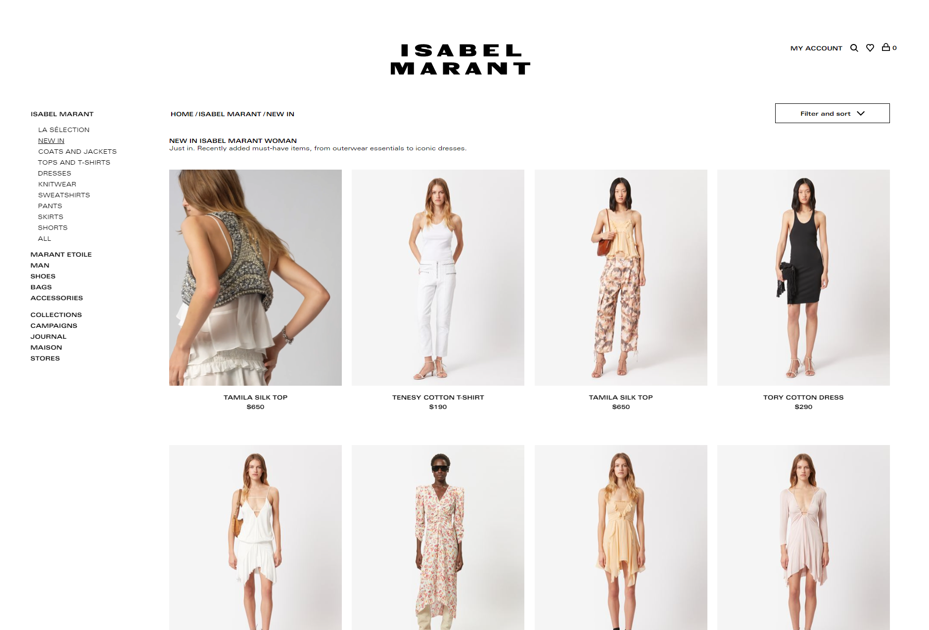
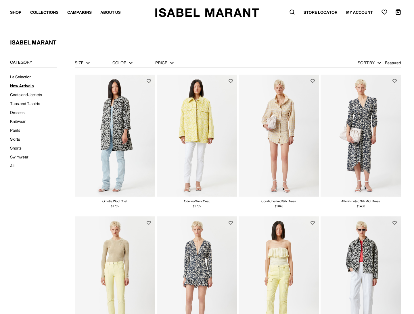
Left: Original Shopping Page ; Right: Concept Shopping Page
The Shopping Experience
After I finished designing the home page, I moved on to design a shopping page.
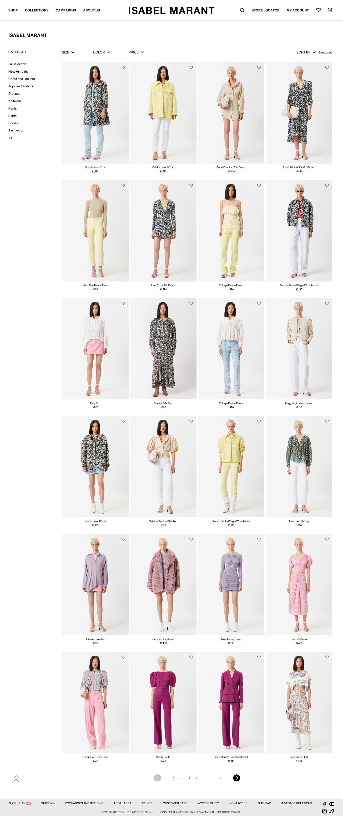
Shopping Experience: Left Navigation
Above the left navigation, and below the top navigation, is the title of the main category the user was currently shopping in. It’s emphasized and separated so that users can clearly see what they’re viewing.
Since the top navigation already provides links to Isabel Marant’s main categories, under “Shop,” I added a left navigation to use as a quick-link menu to the respective subcategories.
On the left navigation, I added “Category” and a line divider underneath it to show that the following links are categories/filters within the Isabel Marant line.
The left navigation displays the subcategories and also acts as a filter where users can choose to only view a certain subcategory, such as “skirts.”
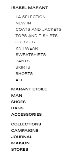
Left: Original Left Navigation
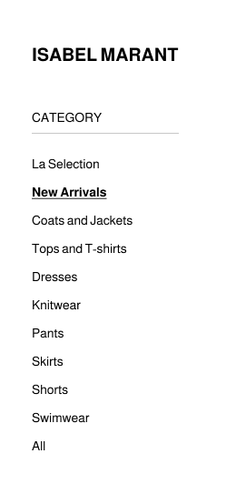
Right: Concept Left Navigation
The current selection, “New Arrivals,” was boldened and remained underline to show users what category they’re currently viewing.
The links were also spaced out more to make it easier for the users to click/touch the link they want and to reduce mis-clicking.
I removed the other brands/lines from the left navigation since the top navigation includes them. Keeping the other brands in the left navigation was redundant and created clutter with too many accordion links. It’s more organized, and user-friendly, to reserve the left navigation to navigate within a particular brand/line- “Isabel Marant” in this case. If the user wants to shop within a different Isabel Marant line, then they can use the top navigation bar to select a different line.
Shopping Experience: Filter Bar
I also re-organized the filter bar.

Left: Original Filter Bar

Right: Concept Filter Bar
I isolated the different filter options and moved them into their own drop-down menu. Isolating the filters into their own drop-down menu allows users direct access to specific filters instead of opening a large window with all the filters to read through and select. This results in less clicking for users to filter and sort.
The filter bar also adds more separation between the headers and the page body.
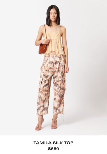
Shopping Experience: Favorites
Isabel Marant has the option to favor something, or add a product to the user’s favorites list, but it’s only available when the user selects a product and navigates to the full product page. Users cannot add products to their favorites list from the general shopping page.
It’s easier to have the ability to favor something without having to open the full product description.
To fix this, I added small hearts (a favorite button) to the top right corner of each product thumbnail. The hearts are unfilled and at 50% opacity at default state; the hearts get filled in red and become 100% opaque when selected/an item is favored. The heart transformation indicates which products are favored/unfavored.
Left: Original Product Thumbnail
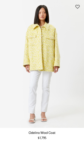
Right: Concept Product Thumbnail
Shopping Experience: Page Numbers
Next, I added pages, or page numbers to the bottom.
Isabel Marant has a “View More” button that lengthens the page and shows more products, which allows users to shop more products without changing pages; however, I think that extending ecommerce pages like this leads to endless scrolling, which feels never-ending, and ultimately leads to fatigue.

Left: Original
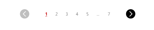
Right: Concept
It’s better to have an obvious ending and have pages to link to. Having a definitive end reduces the chances of users feeling overwhelmed, and having pages gives users a bookmark to come back to.
Shopping Experience: Scroll Up
Finally, I added a scroll-to-top button at the bottom of the page.
The “scroll up” button, which is an upwards double chevron icon, navigates the user back to the top of the page so they don’t have to scroll all the way back up.
When you hover over the button, it has a slight upwards bounce, gets a little bigger, and the text, “scroll up,” appears to indicate that it’s clickable and tells users what it does.
