Coca-Cola: Grab a Coke
Slide left/right to compare original Coca-Cola shopping page to my concept shopping page

Left: Original Shopping Page ; Right: Concept Shopping Page
Grab a Coke
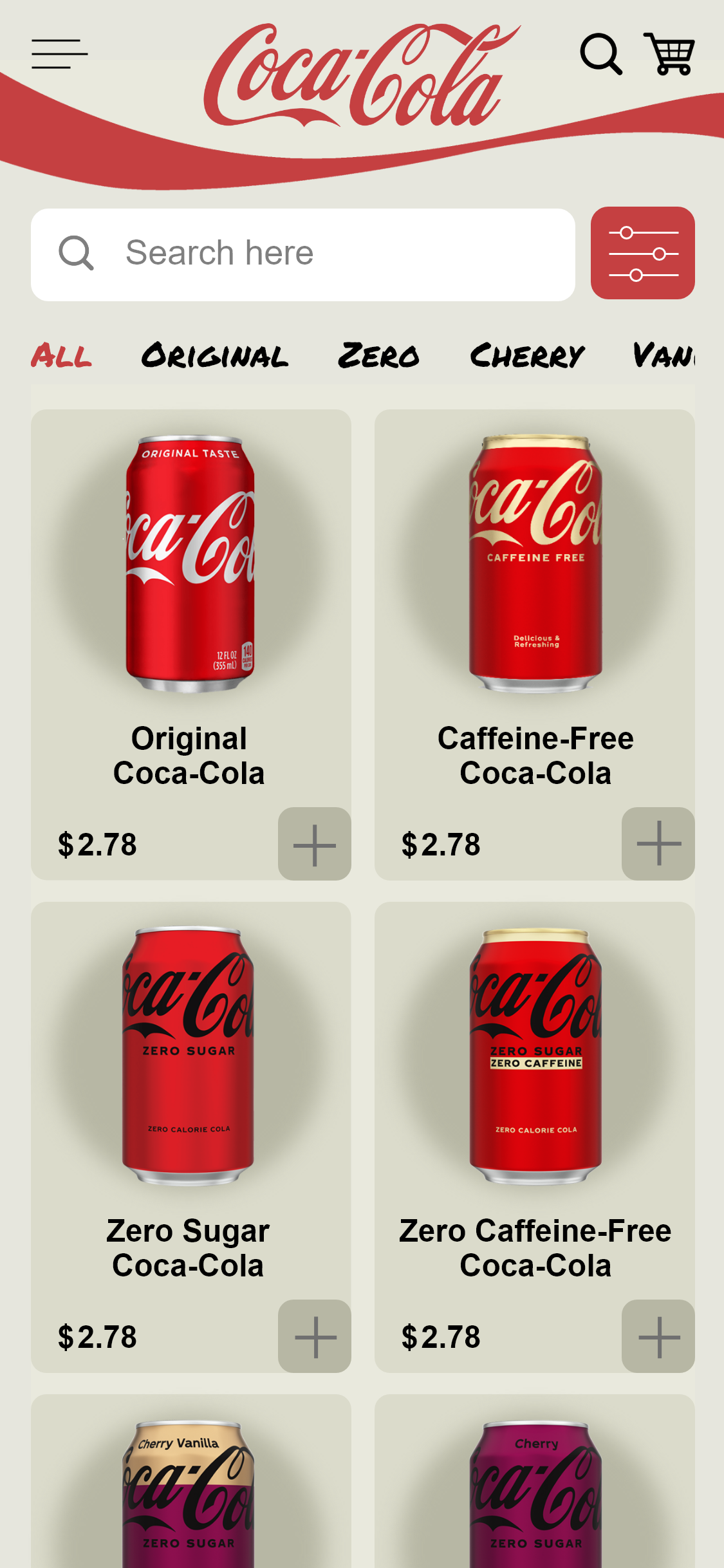
The “Grab a Coke” screen is where users can shop and view more details about Coke and its various flavors/lines.
Coca-Cola doesn’t use its app to sell Coke products directly since it uses vendors for that, but I added the option to purchase the products for the purposes of my project. I wanted to showcase how I would design a similar app and to gain more prototyping experience.
I went for a slightly monochromatic color scheme for the “Grab a Coke” product page. I used different darkness levels of the off-white theme color to separate the different elements and selections.
There is a large search bar that is used to search and filter through the current app page/category. So, the large search bar will only search within the “Grab a Coke” products. The search bar next to the cart is meant to act as a general search for the overall app.
Grab a Coke: Filter Menu
Next to the search bar is a filter button/menu. The filter menu applies to the current category, so in this case the filter button will open the “Grab a Coke” filter menu.
When filters are selected, the selection circle turns red to indicate the user’s selection(s).
One of my favorite things to do is add little details that make the user experience more enjoyable by providing engaging visuals and user-feedback. In this, I made the filter button turn dark gray, made the filter circles slide to opposite sides, and changed them to red. You’ll find similar details throughout my prototype.
Filter Menu: Drafts/Sketches


Filter Menu Brainstorming and Sketches
Grab a Coke: QuickView
The plus button(s) is a quickview overlay; clicking the plus button opens a pop-up where you can choose the product packaging and quantity.
There is an downwards-pointing arrow that indicates it’s a drop-down menu.
The “Add to Cart” button turns red and the Coke bottle rotates/flicks to give feedback and indicate the product was added to the cart. The “Add to Cart” button also transforms to “Added to Cart” to provide additional feedback/confirmation, and a red Coke bottle appears in the shopping cart in the top right corner.
I provided multiple, detailed, visual effects to show the user that their product is in their cart and to give a fun shopping experience.
