Coca-Cola: Home Page
Slide Left/Right to View Before & After
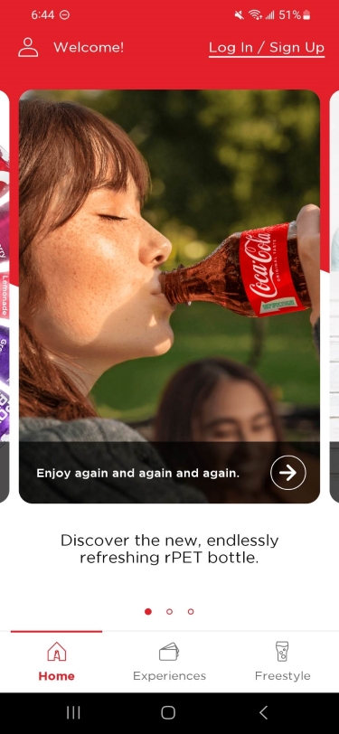

Left: Original Home Page ; Right: Concept Home Page
The Home Page
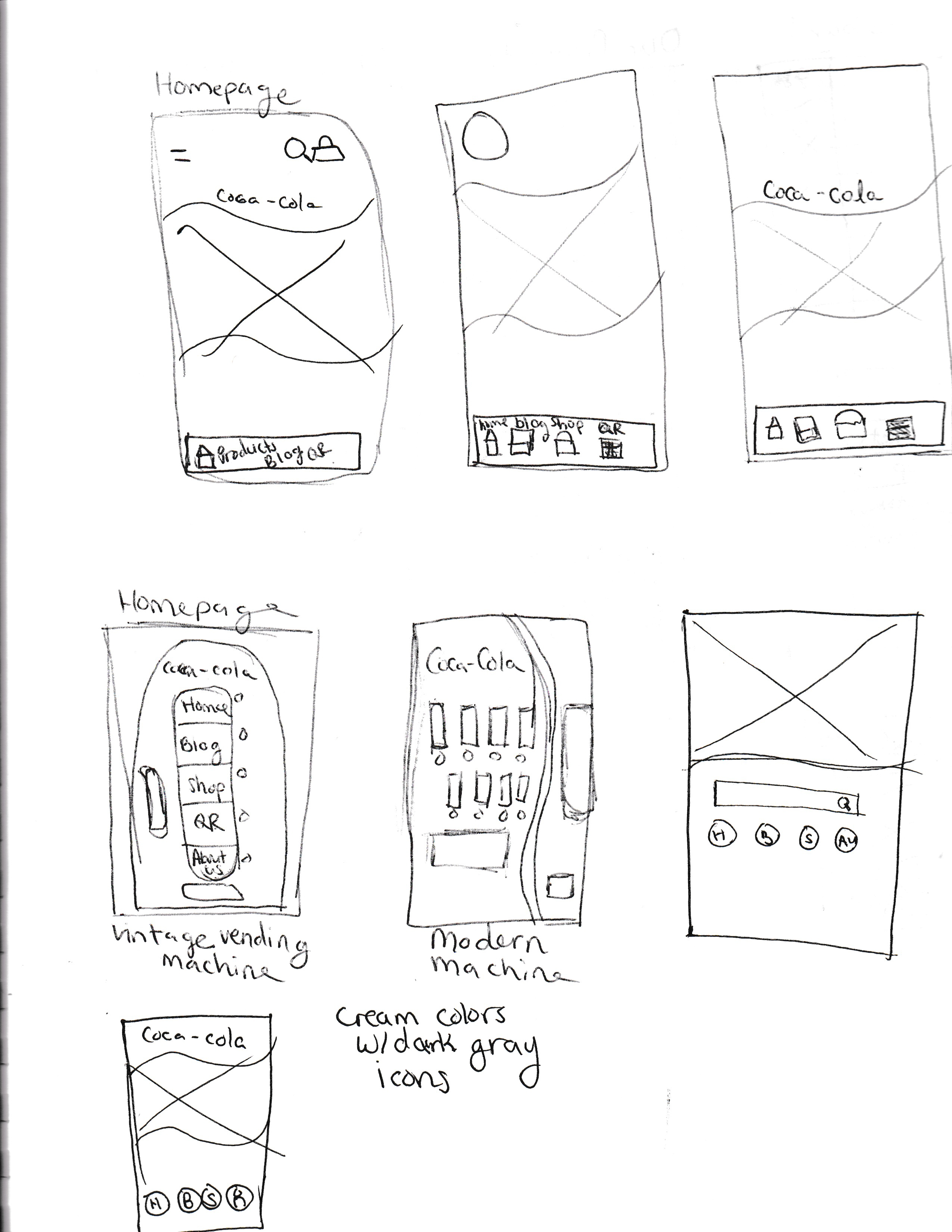
I brainstormed several home page ideas that would set the tone for the rest of the UI design. I sketched wire frames to draft where things would go and how it would look.
After sketching the wire frames, I realized that my favorite idea (a vending machine as the home page with animated cans) would likely be too busy.
I quickly found an image of a Coca-Cola vending machine, put it on Adobe XD, and confirmed I didn’t like the idea in practice and scrapped it.
My next idea was a minimalistic design; I wanted to keep the home page simple with a large image and a top menu and bottom menu. The concept looked nice in practice but I didn’t find it memorable or unique.
I came up with the collage idea (the final concept) on a whim and implemented a high fidelity prototype without drafting it. My original idea of one main image stayed and I simply added a collage of images below it to act as the home page categories.
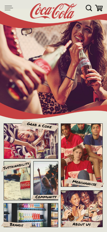
I thought about masking the category images into polaroids to emphasize a nostalgic feeling, but found that polaroids made it look busier than I liked. Instead, I labeled the sections with masking tape and “Permanent Marker” font, which emphasized the warm nostalgic feel while creating separation and legibility.
The bottom navigation bar was also scrapped to simplify navigation, declutter the pages, and create a straight-forward user experience.
To tie in the warm images and scrapbook-like aesthetic, I used off-white, light brown, red, dark gray, and black as theme colors.