Case Study: Coca-Cola App
Try my interactive Coca-Cola desktop website : Coca-Cola Prototype
Program used: Adobe XD


The Problem
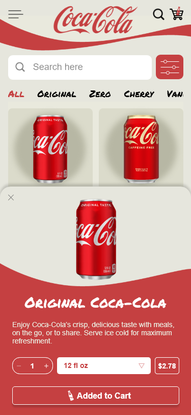
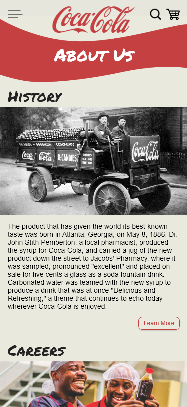
The current Coca-Cola app has bulky sections that take up a lot of real estate, which means less content to fit onto the screen and difficult navigation. The app also lacks product information and accessibility- there’s nowhere to simply view the products they offer. Overall, the app is a clunky news article app that is not user-friendly and limits content consumption.
The Goal
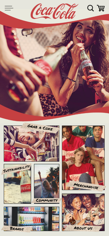
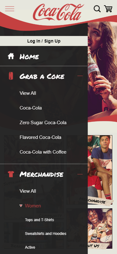
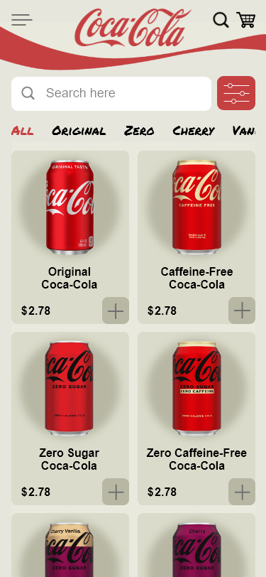
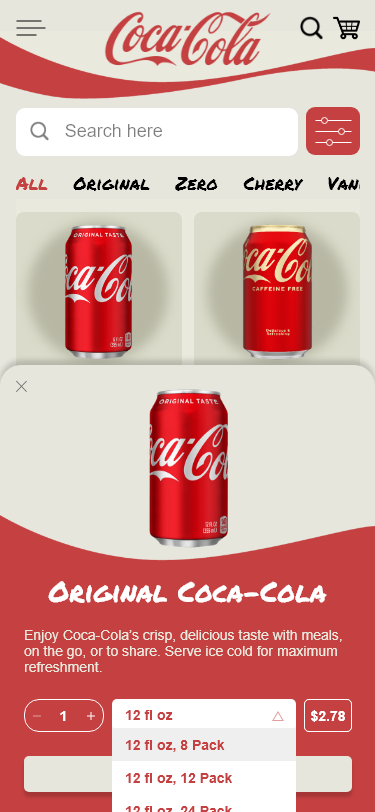
The goal is to direct users to view/shop for products as easily as possible and modernize the design. To do this, I need to change the structure of the interface by adding more categories, menus, filters, intuitive flows, and feedback loops.
![]() Improve aesthetics
Improve aesthetics
![]() Add more filters and navigation bars to improve site navigation
Add more filters and navigation bars to improve site navigation
![]() Restructure and simplify interface
Restructure and simplify interface
Conclusion
Coca-Cola is the most recognized brand in the world; however, the app doesn’t reflect that. The app UI is unintuitive, clunky, and difficult to navigate, overall.
By segregating Coca-Cola’s categories on the home screen, adding an organized hamburger menu and filter menu, and using detailed animations give feedback, users can navigate the smartphone app with efficacy.
Screens and Prototyping
Click on the links below to read my write-up for the respective screens and prototyping.

